RAFN
RAFN Construction, a Seattle-based commercial construction firm, engaged in a comprehensive rebrand to better reflect the quality, precision, and collaborative nature of its work. The objective was to reposition the company with a more contemporary, design-forward identity while maintaining credibility within a highly competitive and traditionally conservative industry.
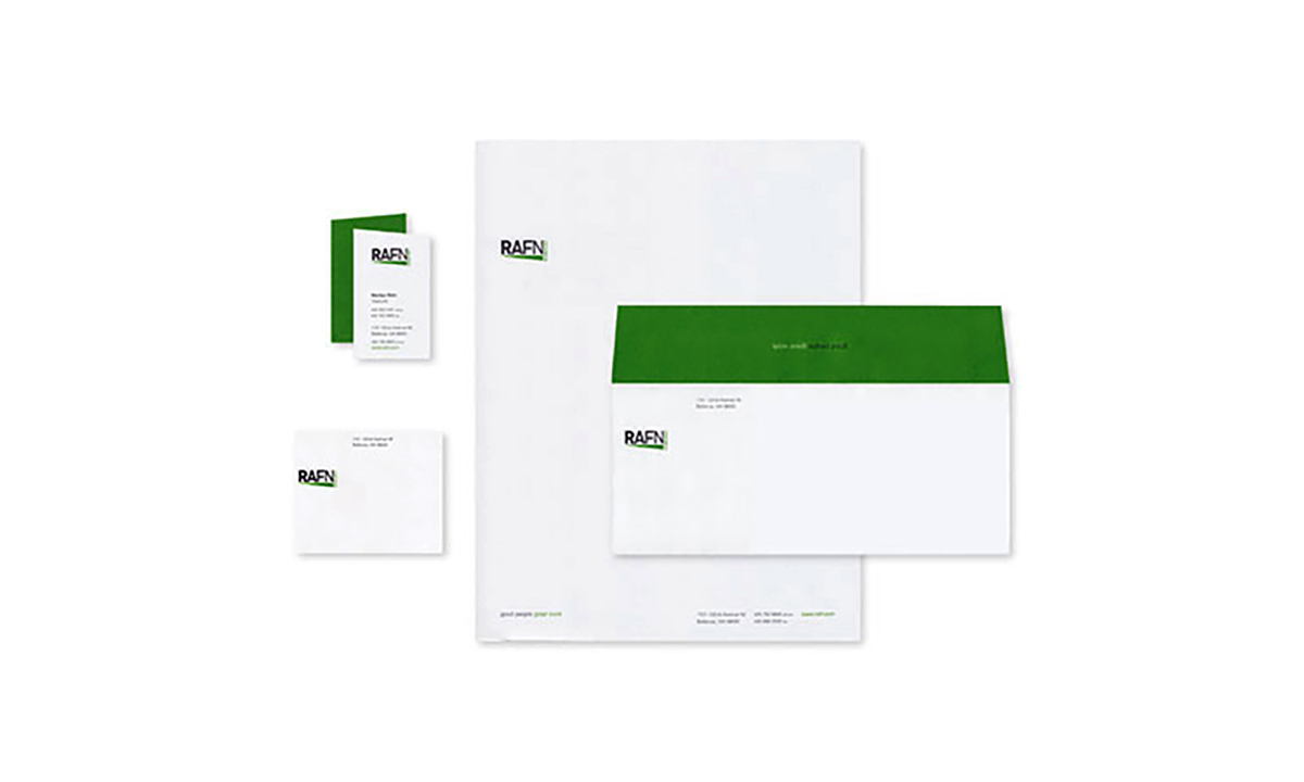
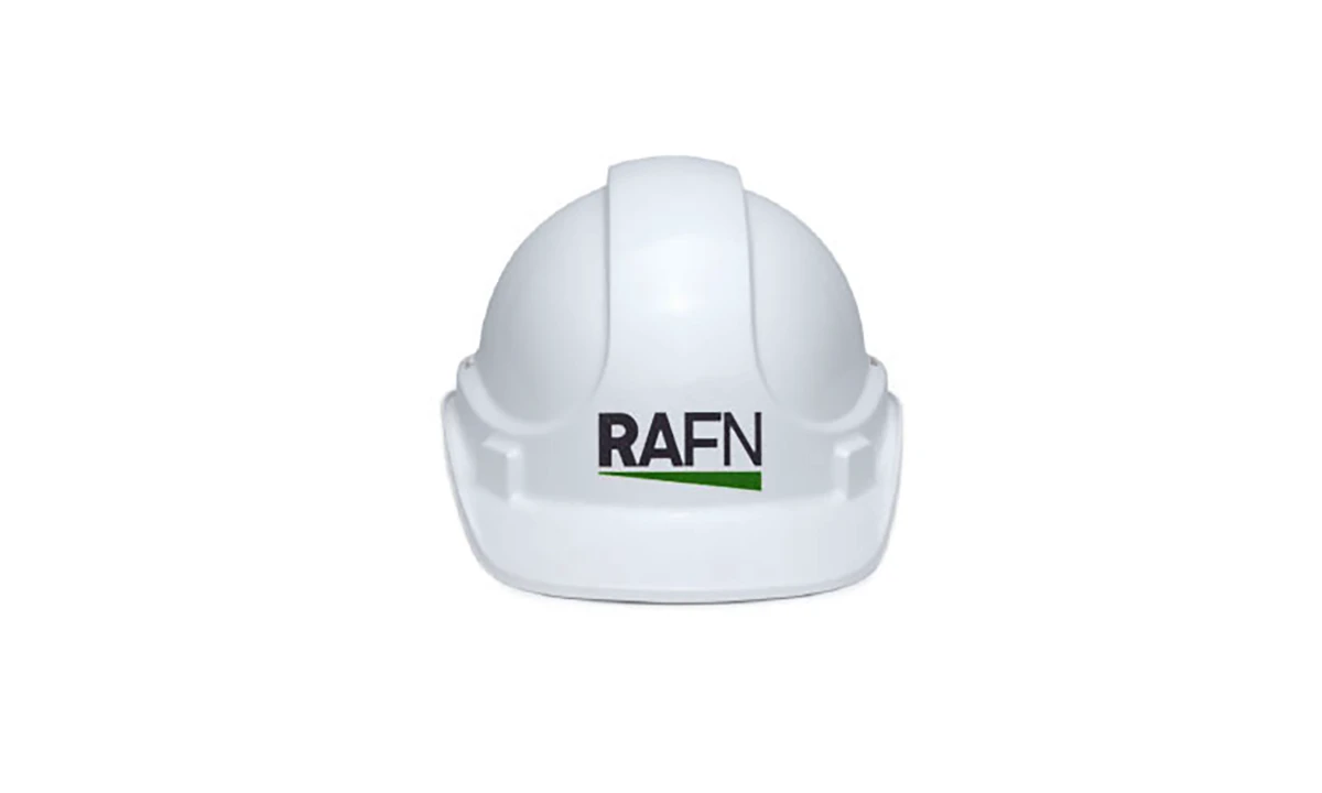
The solution was a refined, systems-driven identity built on clarity, restraint, and structure. A minimalist wordmark paired with a distinctive green underline creates a subtle but ownable brand gesture—reinforcing the company name while introducing a visual element that can scale across applications. The color palette draws from the Pacific Northwest landscape, balancing neutrality with a vibrant accent that signals growth, sustainability, and forward momentum.
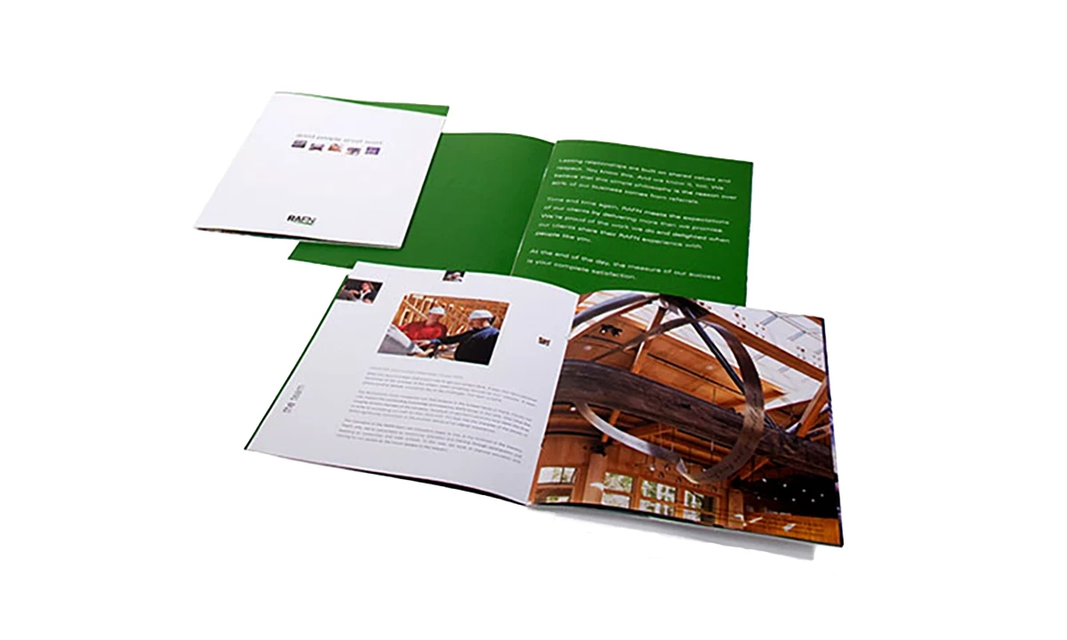
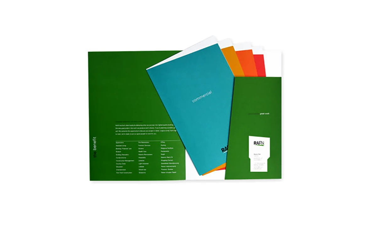
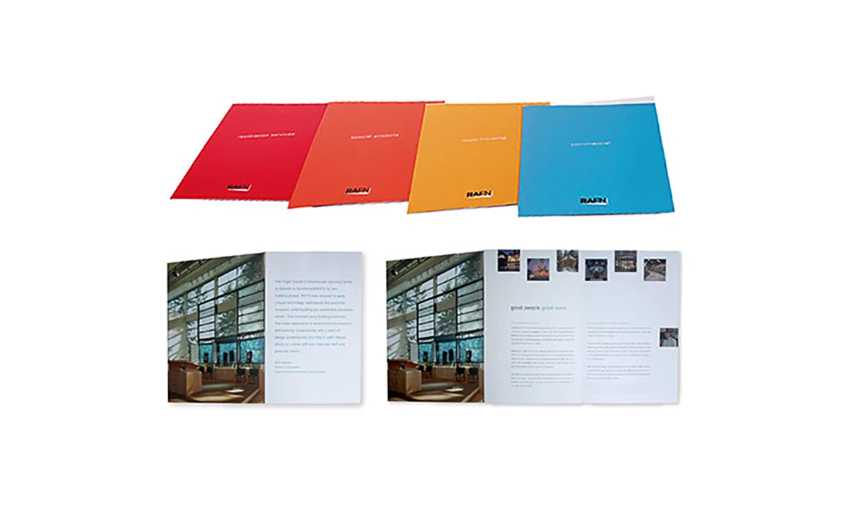
The broader identity system emphasizes discipline and consistency, using strong typographic hierarchy, grid-based layouts, and generous white space to mirror the precision and order inherent in the construction process. This approach creates a flexible framework that supports a wide range of communications while maintaining a cohesive brand presence.
Photography plays a central role in the system, showcasing materials, craftsmanship, and built environments at scale. The combination of bold imagery and restrained design creates a confident, modern voice that differentiates RAFN within the commercial construction sector.
The identity was extended across a comprehensive set of print and digital touchpoints, resulting in a unified brand experience that positions RAFN as a trusted, forward-thinking partner for complex projects.
Services
Creative Direction, Brand Development, Identity Design, Collateral, Brochure Series, Website DesignWebsite
rafn.comAffiliation
Effective Design